Asset management app redesign
The project improved usability by redesigning the two most-used pages of the app for various user roles, leading to a 21% increase in user satisfaction, and attracting over 300 new users.
Intro
Role
UX/UI designerDuration
Aug 2023 — present timeDue to confidentiality agreements, only certain aspects of the design work can be shared, without revealing specific details about the project.
Goal
Redesign the Accounts & Strategies table and the strategy page layout to create a clearer, more intuitive interface that not only improves usability for existing users but also enables this part of the platform to be accessible and useful for external financial analysts.
Outcome
The redesign boosted satisfaction among existing users by 21% in testing. Since then, the platform has expanded access to this functionality, attracting over 300 external financial analysts in the last four months and growing steadily.
Process
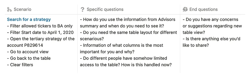
Discover
Research
I gathered users and stakeholders feedback on existing design weaknesses. I explored the problems and areas for improvement.
Interview with users
During my business trip to the client's office, I conducted in-depth interviews with 5 users across various roles and needs.
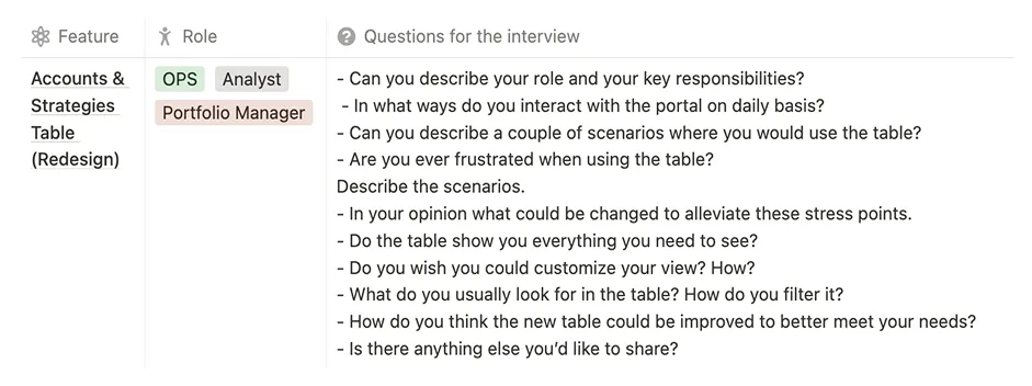
Insights:
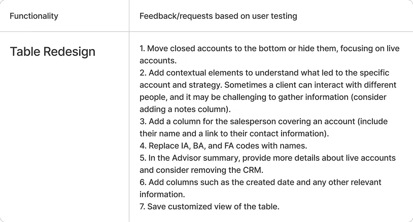
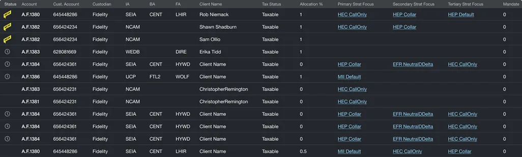
- The table content missed contextual elements like ‘the created date’, ‘salesperson’ valuable for different user types.
- Main focus of the table should be on ‘live’ accounts, as they are relevant and the most important for all the user types.
- Different users use the table for different needs, it's important for the table to be customisable, and to have ability to save this custom view.
Define
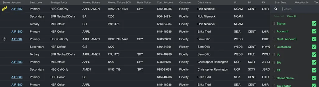
Problems of the table view
Based on interviews and feedback
-
Limited filter options
— few filters available, and they are positioned separately, making them less convenient to use. -
User focus mismatch
— users primarily search for specific strategies and their details, but the table is centred around accounts, resulting in unnecessary extra clicks. -
Incomplete data display
— some columns pertain only to strategies, leaving half of the table blank when displaying other data. -
Inefficient loading
— the table content does not load efficiently, impacting user experience. -
Columns set
— the order of columns is not optimal, and some potentially beneficial columns are missing.
Problems of the strategy page:
-
Inefficient use of space
— the critical information was surrounded by excessive empty space, causing elements being overlooked and key actions being harder to find. -
Complex navigation due to multiple levels of tabs
— the use of multiple tabs across several hierarchical levels made it difficult for users to navigate. -
Irrelevant component borrowing from previous screens
— the major header area was carried over from a previous screen (the table), but was out of context on the strategy page.
Develop
Prototypes
I generated a range of ideas and potential solutions, created simple prototypes.
User testing
I tested my concepts with end users and stakeholders, refined my ideas based on the feedback and defined the solution. I used interactive prototypes to test with users once again and then moved forward to developing design specifications.
Deliver
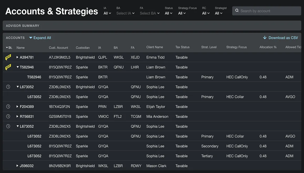
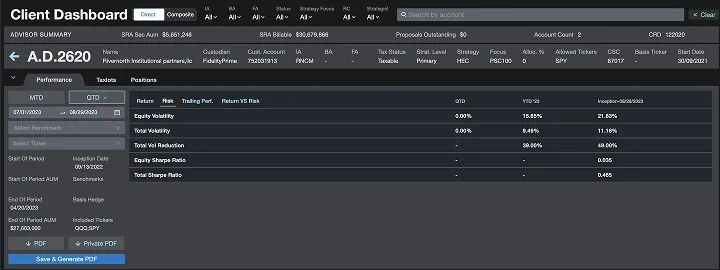
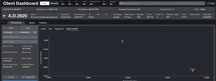
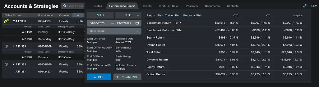
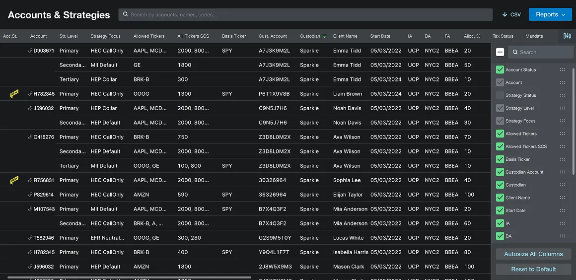
Solution for the table view
Improvement of the table view by making data easier to access, simplifying navigation, and giving users more ways to customize their experience.
-
Surface-level strategies
— moving strategies to the forefront makes strategic information more accessible, aligning with the main user scenario. -
Simplified navigation
— removing the tree structure simplifies navigation, helping users find data more easily. -
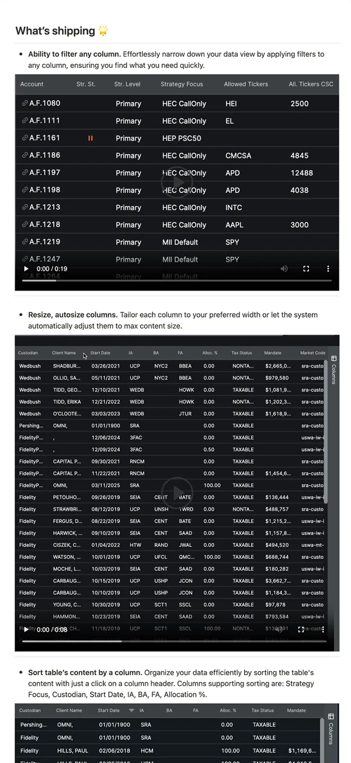
Efficient filtering
— adding filters to all columns enhances efficiency by allowing users to quickly sort and locate specific information. -
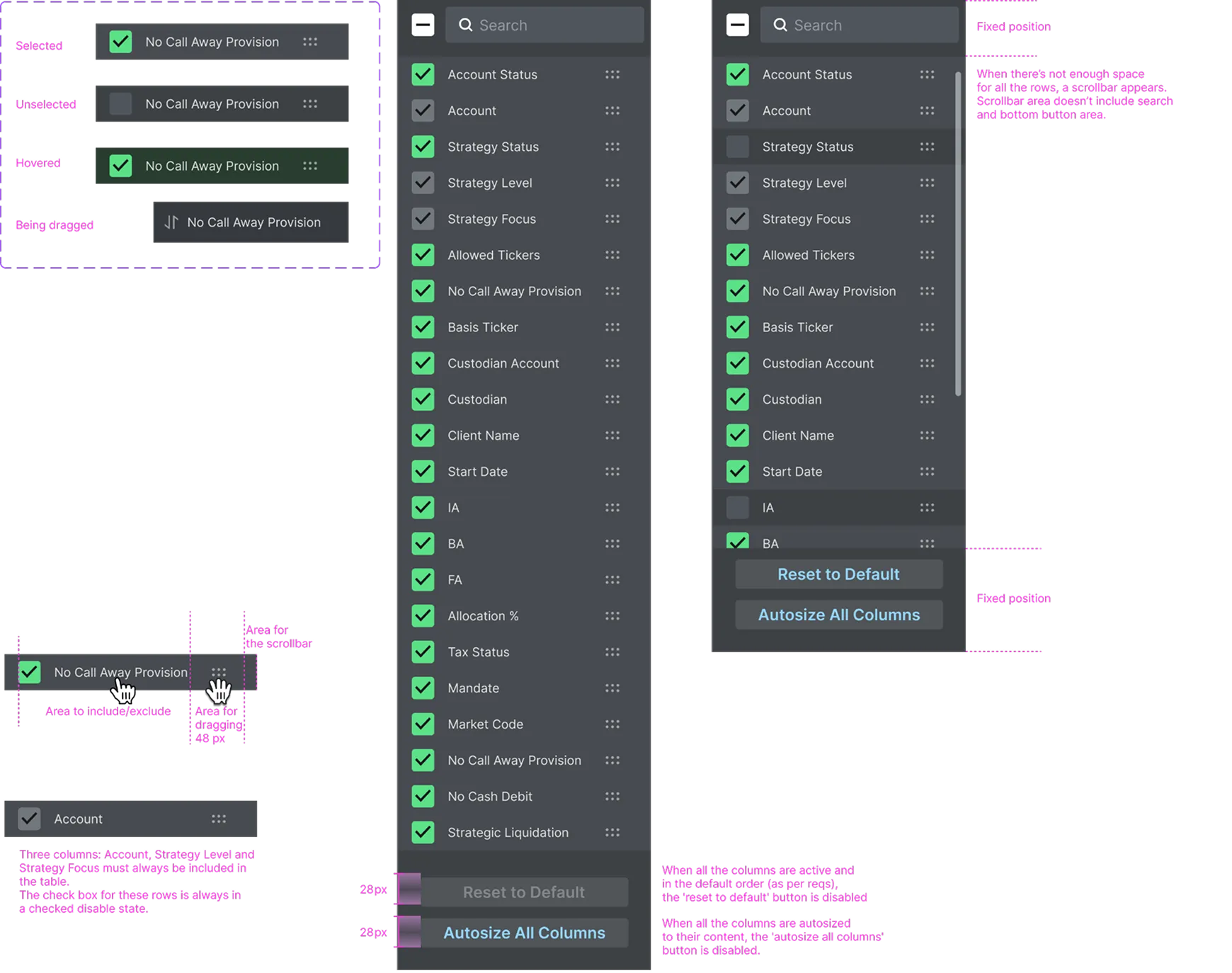
Advanced column customization
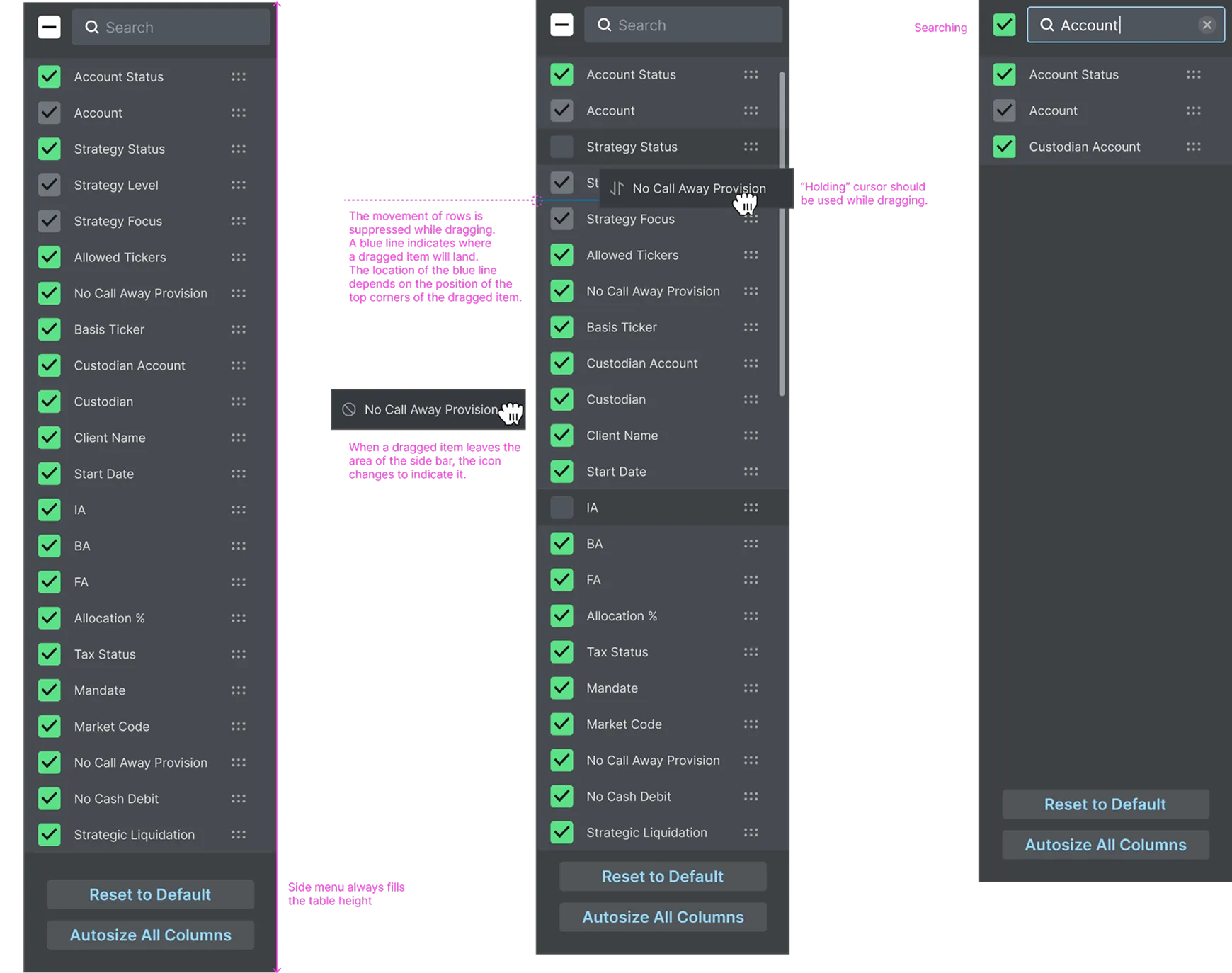
— providing the ability to resize, move, and customize columns with a new menu enhances table usability and personalization by allowing users to arrange and modify columns to suit their preferences.
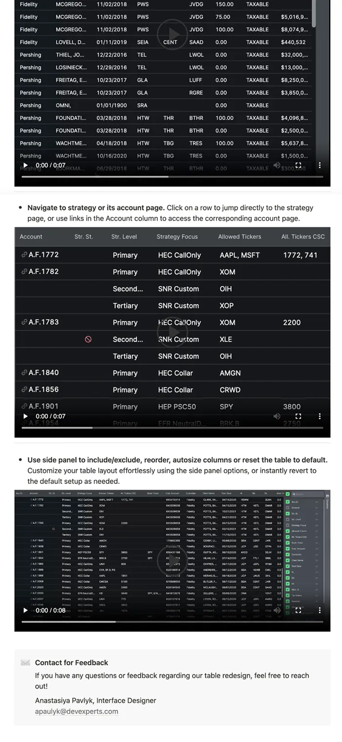
I compiled comprehensive design documentation, including:
- detailed UI mockups,
- interaction flows,
- technical specifications for developers.
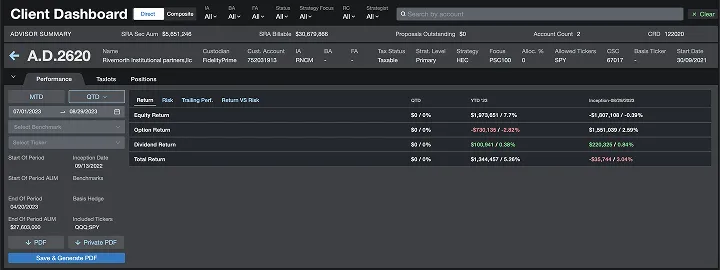
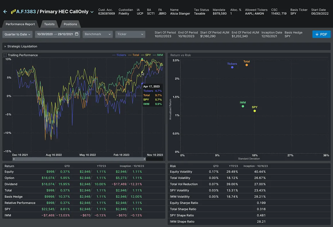
Solution for the strategy page:
-
Sufficient use of space
— all important widgets are moved to a single dashboard with the option to customize the view. -
Improved navigation
— users have the ability to switch between different account strategies or view an aggregated account mode.
Tutorials for users to introduce new features
I prepared short descriptions and videos for users so they can quickly become acquainted with the new features.
Outcome
Improved metric & feedback
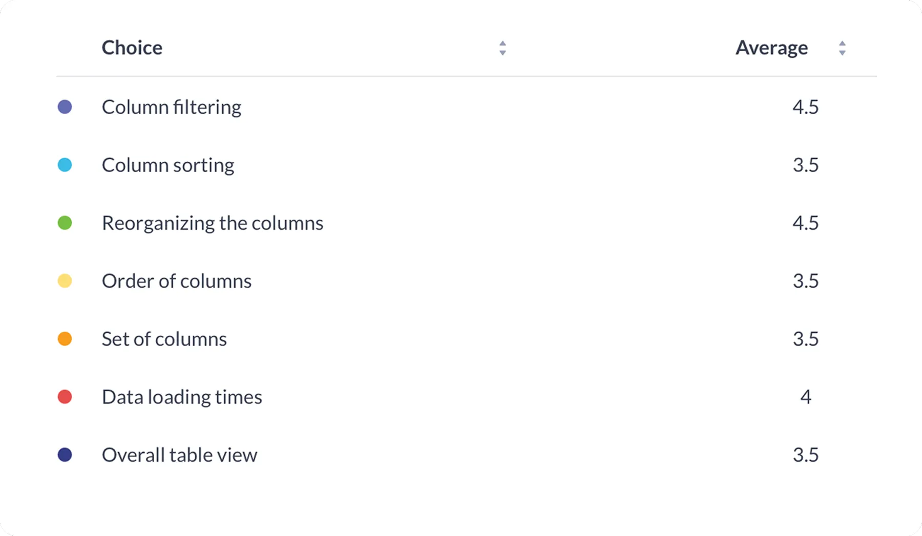
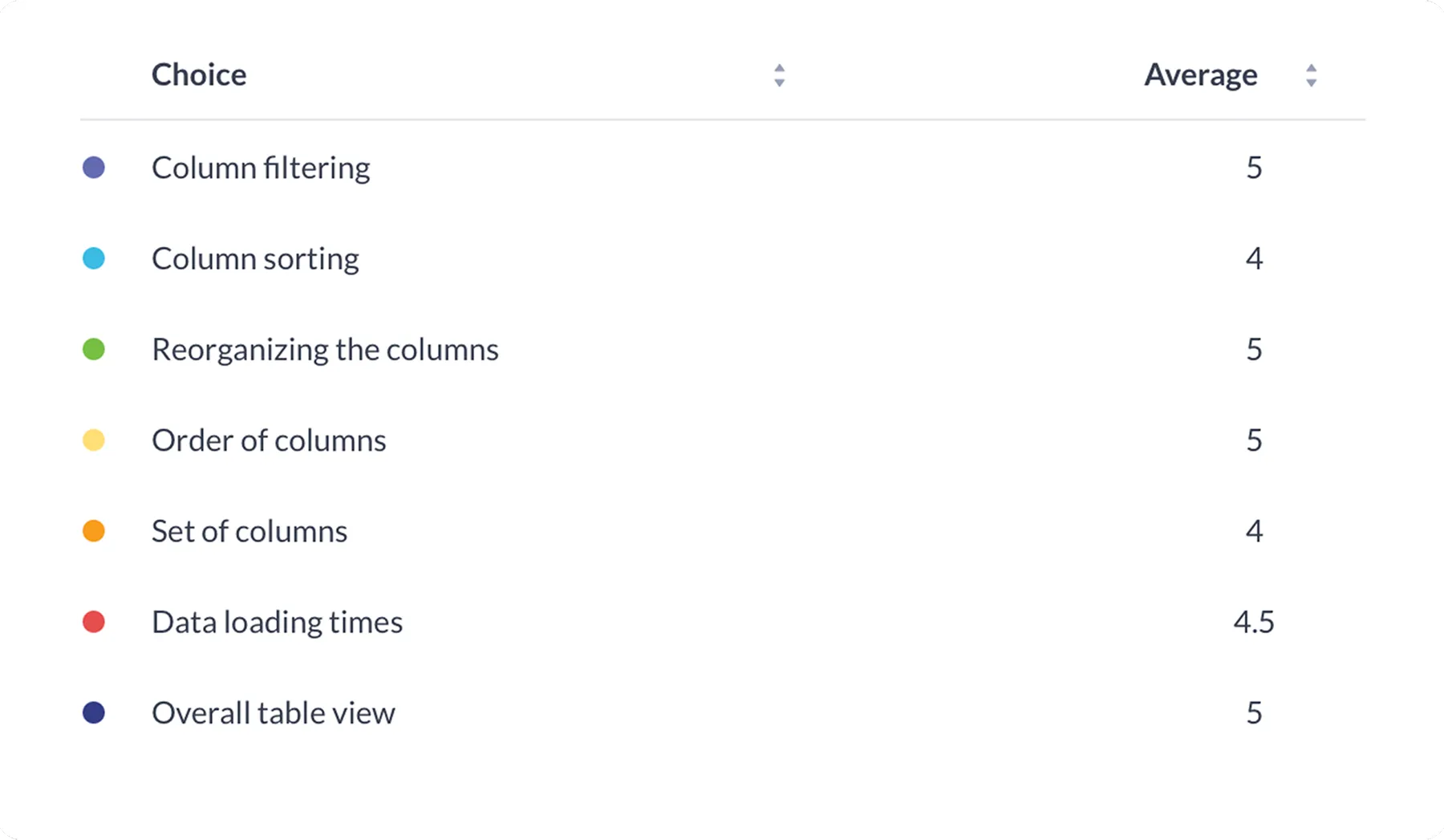
User feedback collected via surveys revealed an average satisfaction score of 4.6/5 across 7 key table characteristics compared to 3.8/5 before the redesign.
Now
While analysing some feedback, I found out that certain solutions were ineffective for senior team members,, who had been missed during user testing. The representation of the account links gave them an impression that this is the only clickable element, and by that made their flow more complicated.
This was a very insightful finding. Fortunately, the necessary changes were minor and quick to implement.
We keep getting user feedback and working on small improvements for the redesigned pages.
Meanwhile, since opening this functionality to external financial analysts, the platform has gained over 300 new professional users in the last four months, steadily increasing its reach in the industry.